
Can You Use Pantone’s 2020 Color of the Year in Your Packaging?
Pantone just announced their color of the year for 2020, and it’s one that we can get behind. Say hello to Classic Blue, a steadfast and dependable color reminiscent of a wide-open evening sky. We also saw this color not long ago as one of Pantone’s 2020 Spring/Summer 12 biggest color trend picks. So, how can you use it in your packaging? Let’s take a look at how other companies have incorporated variations of this saturated true blue and what colors combos are rock solid.

Blue has always been favored by people. Even the saying “true-blue” alludes to the idea of blue being the color of constancy. It’s often described as peaceful, tranquil, secure and orderly. Similarly, it’s a color that we’ve seen have great success in the packaging world. However, blues can be hard to get right. It’s important to talk to your manufacturer if you have a specific tone in mind and they can be sure to match it.
Even Keel
Warm sage mixed with deep orange and pink are a great complement to Classic Blue
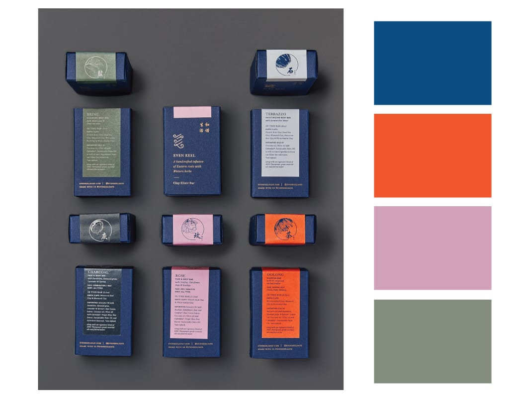
Brooklyn-based, Even Keel infuses botanicals and herbs into their vegan bath & body products. Batched in small quantities,the skincare line is served up in deep blue packaging that complements the natural hues of the products themselves.
Fortnum & Mason
Vibrant red adds life and personality to a blue and white English country illustration
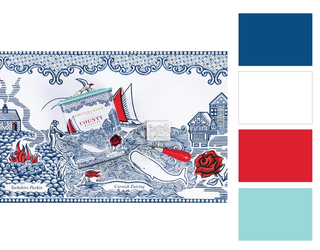
First founded in London’s Piccadilly in 1707, Fortnum & Mason puts great care and attention to detail into their packaging. With designs that draw on old tapestries, book illustrations and woodcut prints, they have been long devoted to the “unboxing” pleasure long before it was even a thing.
In the wrap-around design of their Country Biscuits, classic blue and white work together to create an intricate background scene, allowing the red colors to draw your eye.
Fort Point Beer Co.
A moodier combination of gold, burgundy and light blue gives geometric line art center stage
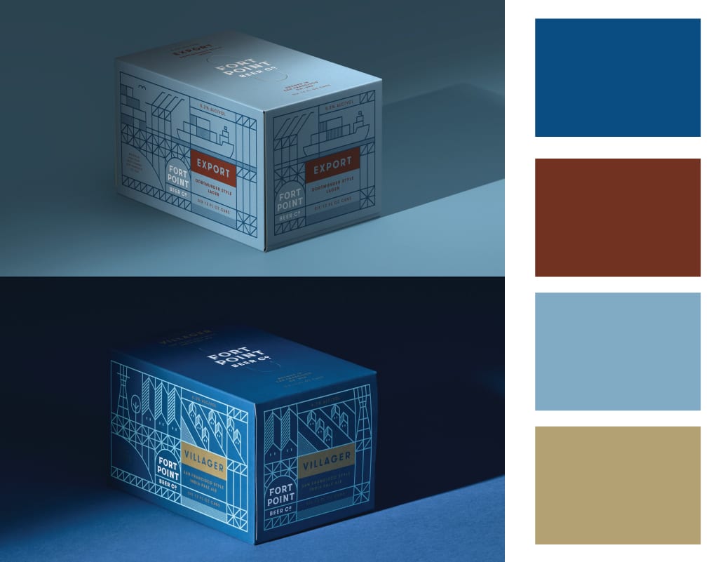
Fort Point Beer Company takes you on a drive through San Francisco. You’ll see the Golden Gate Bridge, Sutro Tower, and the stunning Golden Gate Park; all creatively displayed on cans of their local brews. There’s no denying it; the craft brewery, who calls San Francisco home knocked it out of the park with their geometric designs (each type gets its own illustrated look).
The Bijou Factory
An artistic mix and match look pairs with pops of iridescent gold, light pink and aqua

The Bijou Factor, a company that specializes in self-made jewelry kits smartly developed colorful packaging that matches the product tones. The shapes on the outside remind us of pieces of handmade jewelry or someone having fun with a paintbrush. The bright blue, in particular, pops like a sapphire. In short, this is packaging that makes us smile.
Sunbird Rooibos
Bold blue layered under gold foil add a rich complexity to the packaging
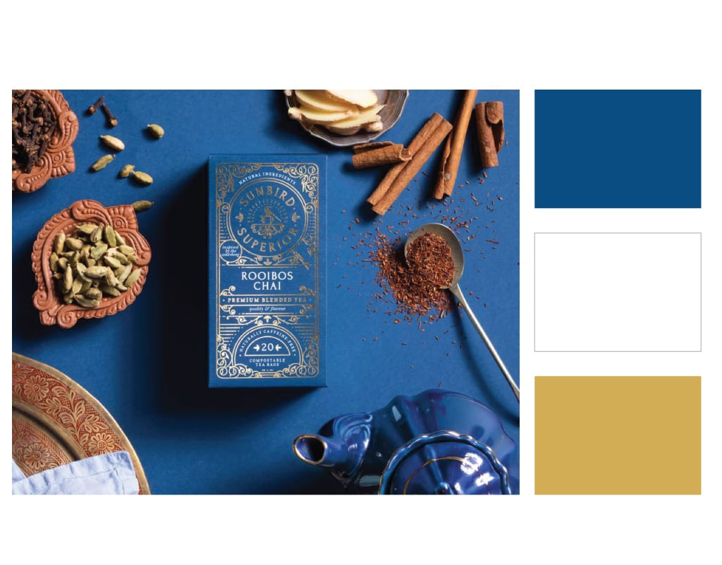
Sunbird Rooibos is the only company in the world to offer organically grown Rooibos tea from a single- origin source. Founded in South Africa by a husband and wife team, Sunbird’s tea is made with pure Rooibos, made unique by climate and soil. The teabags are housed in beautiful boxes with gold foil, intricate illustrations and rich colors.
Zephyr Coffee Co.
A vibrant blue, coral, and turquoise add life and personality to a contemporary white bag.
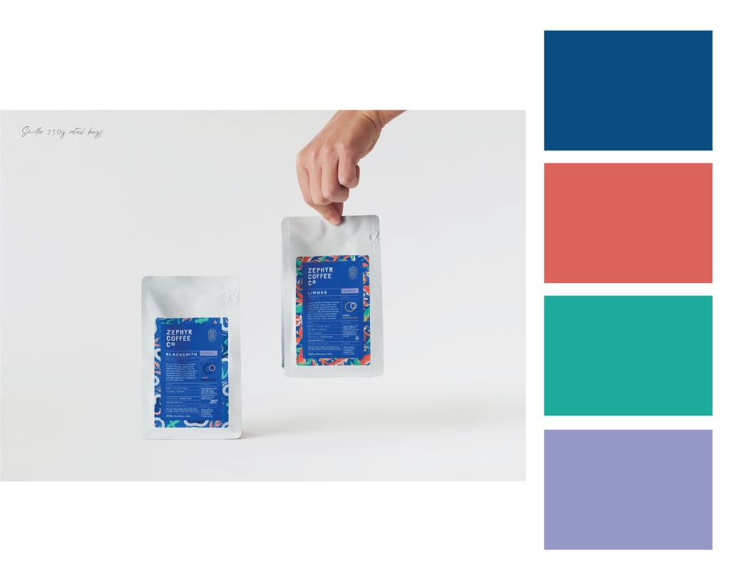
Zephyr Coffee Company’s branding has an artistic appeal that’s unlike the traditional coffee landscape. Instead of using blacks, browns and reds, Zephyr invited local mural artists to design the artwork for their coffee bags. The result for this New Zealand based company, is a stunning showcase of fresh blues, purple and pops of coral. Certainly, perfect for a youthful coffee audience.
The Pantone Color of the Year certainly didn’t disappoint. Can you add some Classic Blue into your packaging? Let’s talk.
How can we help?
We’re all ears. Drop us a line and we’ll get in touch!


See It to Believe It.
Get started with a sample CompanyBox mailer.